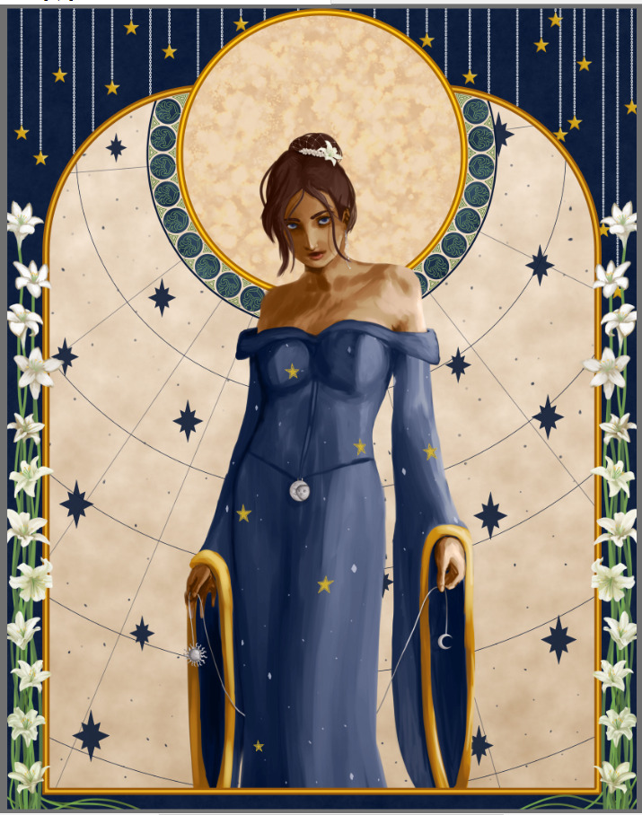
Health Problems, I did Finish that Drawing, Lemon Piglet.
January 17, 2024
I have no idea where to start this. Since the 5th I've been awful, simply put. I've been to a clinic, urgent care (who just said "sucks, go to emergency"), and the ER. I got prescriptions from the ER visit that are supposed to tide me over for a while, and I'm supposed to see a doctor early next week. This entire experience has been miserable, painful, stressful, and humiliating. I broke down crying at my dentist appointment a couple days ago. I've never had any anxiety with dentists before, everything just got to me. (I guess to be fair, one of my current problems is nausea and I got a wave of it while doing my x-rays, so I started getting nervous if it would be an issue through the whole appointment, which set me off.) I went to the dentist because I had sensitivity that got way more intense in a couple days. The consensous was that I'm grinding my teeth (more) from stress. My teeth are completely fine, except I have a small cavity in a tight spot on the complete opposite side of my mouth. I feel incredibly frustrated, stupid, and ashamed. I feel like I'm wasting everyone's time and effort. I feel like a waste of money and resources. I'm a wreck, put simply. I'm afraid to talk to any of my friends about this, because I'm already such a complain-y person. I don't know what to do. I'm afraid for the future.
Less complaining, I did finish that picture, I think on the 4th? and I'm so thankful I did, I don't know if I'll have it in my to mess with anything by the time it's due (the 24th.) If I am feeling up to it I'd like to tweak her expression just a hair, and a few small details (I noticed I didn't put a shadow underneath the flower on her head....)


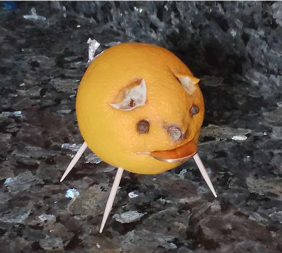
Some amount of time ago, I think around the 7th? before things god bad-bad I made a lemon pig. It's very cute. I gave it my shiniest penny. Within 24 hours I was reduced to the worst pain of this whole month (In retrospect, I should have gone to the ER then.) The lemon piglet did not bring me good luck for this new year. I still think it's cute, though.
Sorry for the downer entry, I hope everybody's been having a good January! I want to make more pixels soon (currently working on a doll.)
Another Art Update
January 2, 2024
Hey it's the second!
I'm not normally concerned about the inconsistencies in my art but the difference between the last update and what I'm going to show here is so ridiculous. Consider it a reminder to use references lol. (okay to be fair to the previous sketch, it was supposed to be very cartoony)
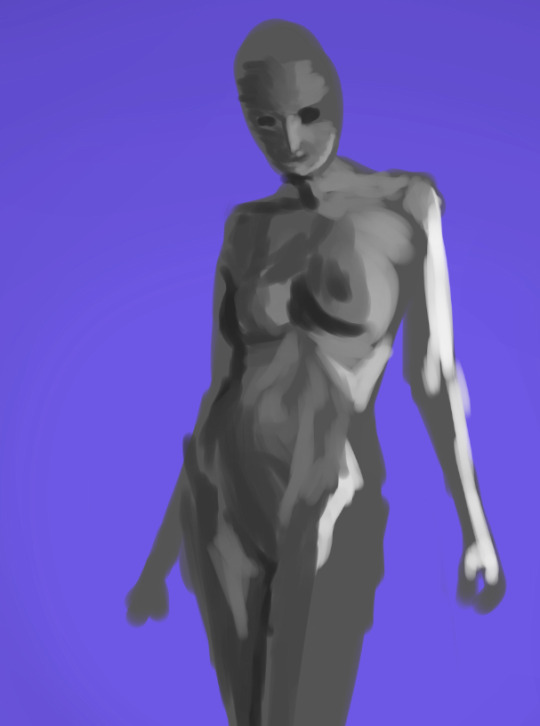
Backing up to the 27th, after I wrote that diary entry I felt inspired to do one of the "____ year of art" collages. I then had to draw something for December because I've made no complete art that month, so I did a really fast portrait study just to fill the slot. Otherwise, I noticed my two favorites from the whole year were the two with the best shading/value balance. (I got an unprompted comment after uploading from someone who said those two were their favorites, as well.) So with "do better with values" and "wow using a reference makes such nice looking art what a surprise" I now have this:

There's still parts I'm not thrilled with but it's sooooo much better than my first sketch. And there was no way I was going to get the second sketch to look good, even with a more cartoony style, without reference. This one's reference BTW, is (nude, so not sharing here) from Quickposes.com ; it's in the Chiaroscuro section.
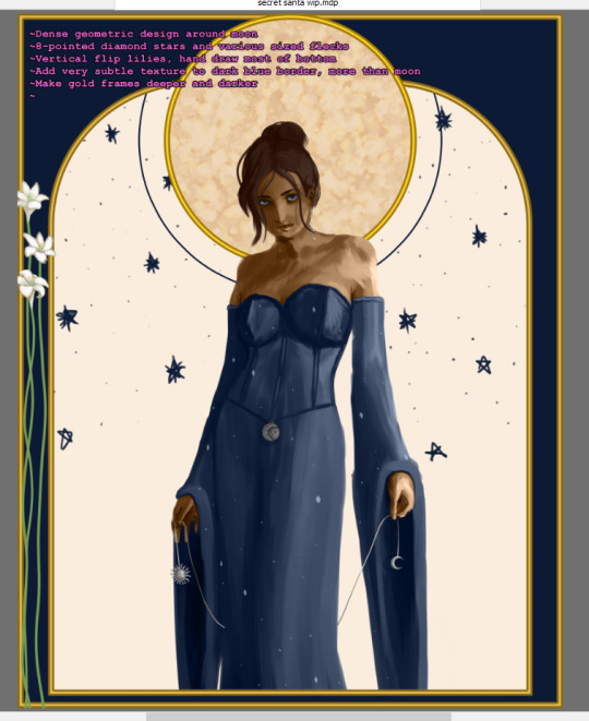
I actually was hanging out with the friend that this will go to recently and wow am I glad I did because I saw the room this will theoretically go in and despite being extremely jealous of the design I somehow forgot her walls aren't actually dark blue. In fact, they're light with lots of dark prints on the walls. (It's the ceiling that's dark blue.) So now the backgrounds are these colors and I'll probably leave them like this. I like the inverted star map idea for the inner background, how it lets the dress pop. You can read some of my notes on the actual picture, but there's a lot more I want to do.
The colors are kind of flat, because I actually drew the character in black and white and just masked colors over it afterwards. Her expression is not quite there, I don't know for certain what I want but this isn't clicking. The sleeves are leaving a lot to be desired, I will probably stare at a lot of wizard costumes for reference. Major one: The dress and character could overall use a lot more...whimsy? I'm planning to put flowers or some other sort of ornament in her hair, but otherwise its just eh. Changing the metals on her to gold may help, but I worry that may be a little too matchy-matchy. The more I look at it the more I hate the top half of the dress. Honestly, most of the dress. I think I'm going to make it more wizard robe-y and give it a leg slit. Last, I want to think of something to add some visual interest to the top corners of the blue frame.
Thanks for listening to me ramble. I leave you with an early shot of the sketch that I kind of like more LOL:

PS: There's a big mess currently from rearranging furniture, once I get a good spot cleared out for pictures I'm updating/concluding the yarn page; and then I plan to make a dedicated yarn craft page.
