Back
How I Take and Edit Photos of Sketches
This will be a guide on my approach to photos of sketches -- from the point of view from a hobbyist; intended for the purpose of uploading the image online to share with others. This is NOT a tutorial on taking professional-grade photos that are high enough quality to create prints from, or to use as marketing photos. It also is not a flat "you must do this" approach. It is very much the point of view of making do with what you have. Also note that the image sizes have been greatly reduced to fit on this page better, you should obviously leave your images as at high of resolution as you want.
To follow this tutorial, you will need:
- A phone or other digital camera to take photos.
- Your sketch + possibly a couple more sheets of blank paper.
- An art or photo-editing program. (I use firealpaca and feature screenshots from it, though it's not required.)
- A basic understanding of value in art.
Taking Photos
Try your best to take photos in bright, natural light. Try going around your house and seeing which rooms/windows offer the best combo. Taking photos outside in sunlight is also a good option, though bright, direct sunlight may cause glare (especially on graphite) and overcast days can be a little blue (also you'll have to work with ever-moving cloud shadows.) Plus being outside isn't always an option for everyone. If your sketch is on a single piece of paper, consider holding a couple sheets of blank paper behind it in case it may be a bit transparent. Most importantly: take the time to tinker with your camera settings and get to know how it works. I have shaky hands, so most often I prop my sketchbook on something as opposed to holding it in one hand.
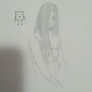
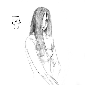
To take this photo, I put the sketchbook on the floor, so the light (a high-up, but thin window + a bright daylight bulb) was directly above. My phone cast a shadow. I didn't focus well on the drawing, plus I used digital zoom on top of it. It's proof of concept, but I personally would never use this.
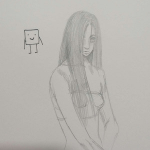
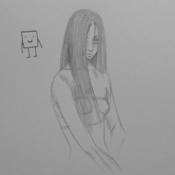
Attempt #2. I held the sketchbook up, and focused the photo a bit better. I didn't entirely get the photo shadow out of the way, though. Plus, while it is very subtle, holding the paper vertically will cause a slow, gradient shadow along the page as it gets further from the light source.


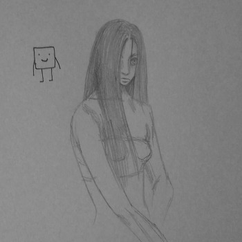
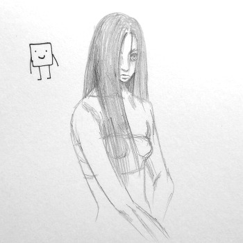
I've decided to choose this picture because the lighting is much worse lol. I want to see how much editing can change. Plus I know very few people use daylight bulbs in their house. I'll compare the outcome of this photo with another one later on, and by extention why you may choose a "worse" photo to work with.
Actually editing the image
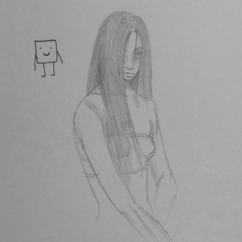
So, the first thing that stands out to me personally is the color of the photo. It's very yellow.
Here I've edited it to be pure greyscale. Now it's apparent to me just HOW dark the photo is. How do I deal with this?
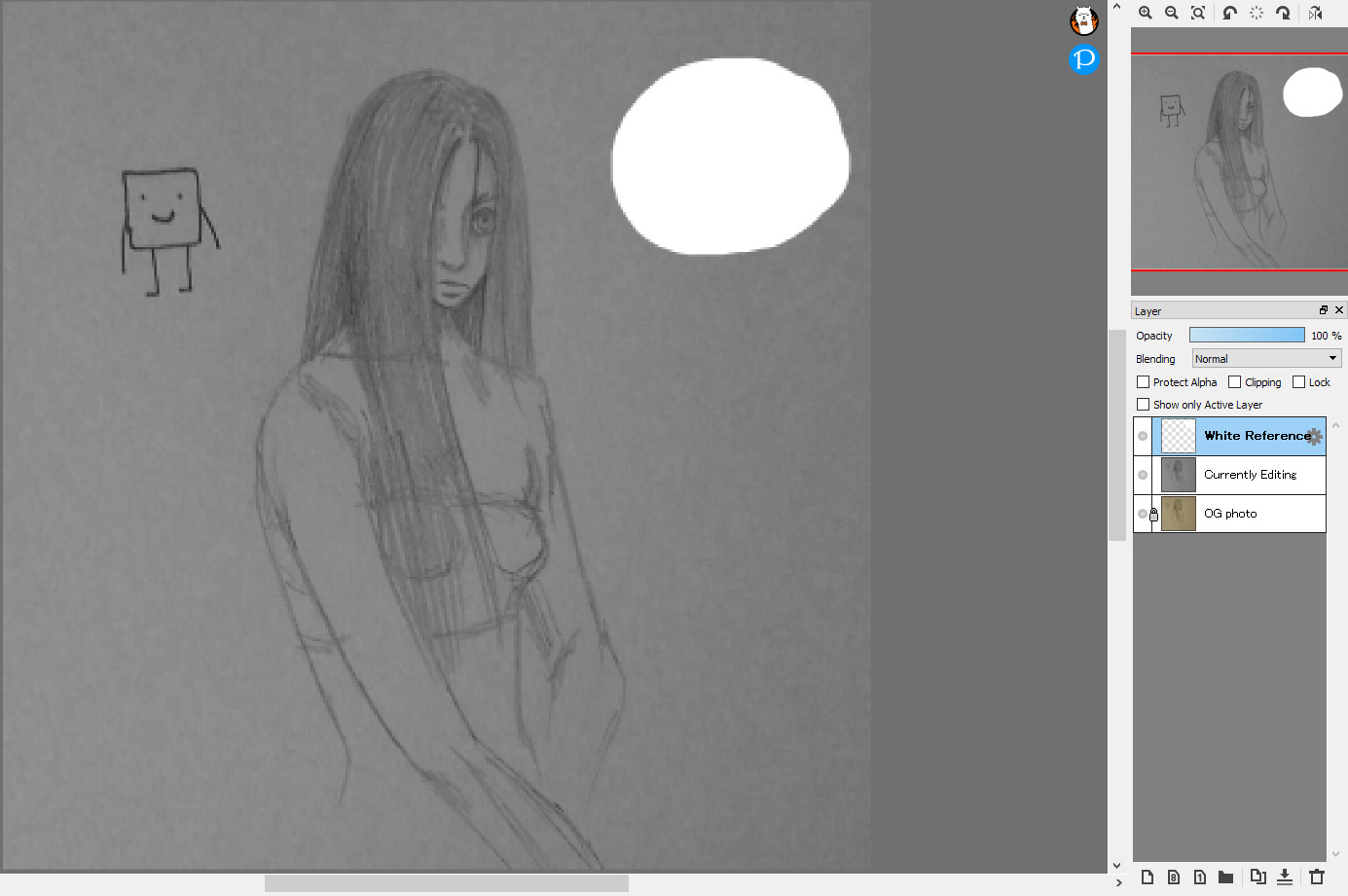
On a new layer, put a blob of pure white. Put it on or near the part of the drawing that is also supposed to be pure white (in most cases, the paper itself.) You can now use this blob as a reference while tweaking your image. You can also put a blob of pure black if you'd like, you may find this helpful if your image features anything intended to be pure black (say you're taking photo of lineart.)
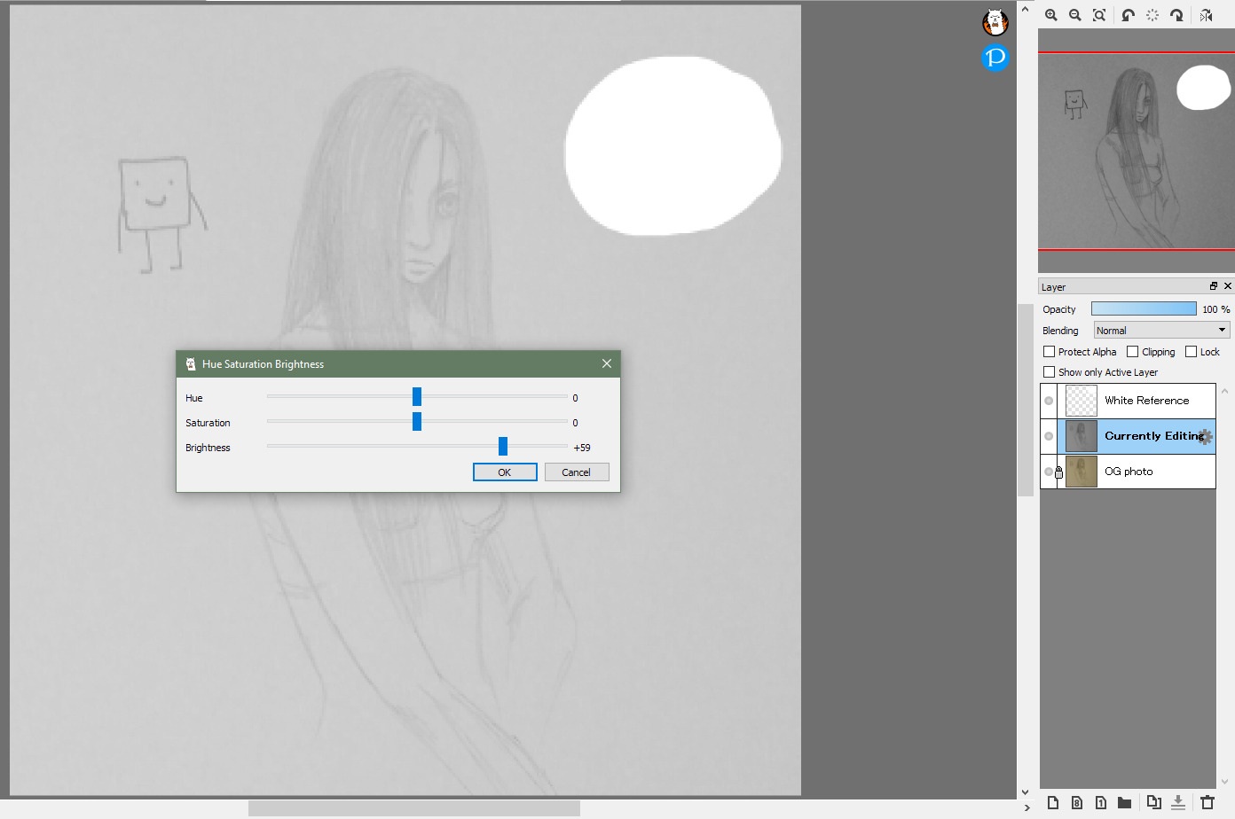
Occasionally upping the brightness (CTRL + U) can be all that's needed, but not in this case. All it does is wash out the entire image. So instead:
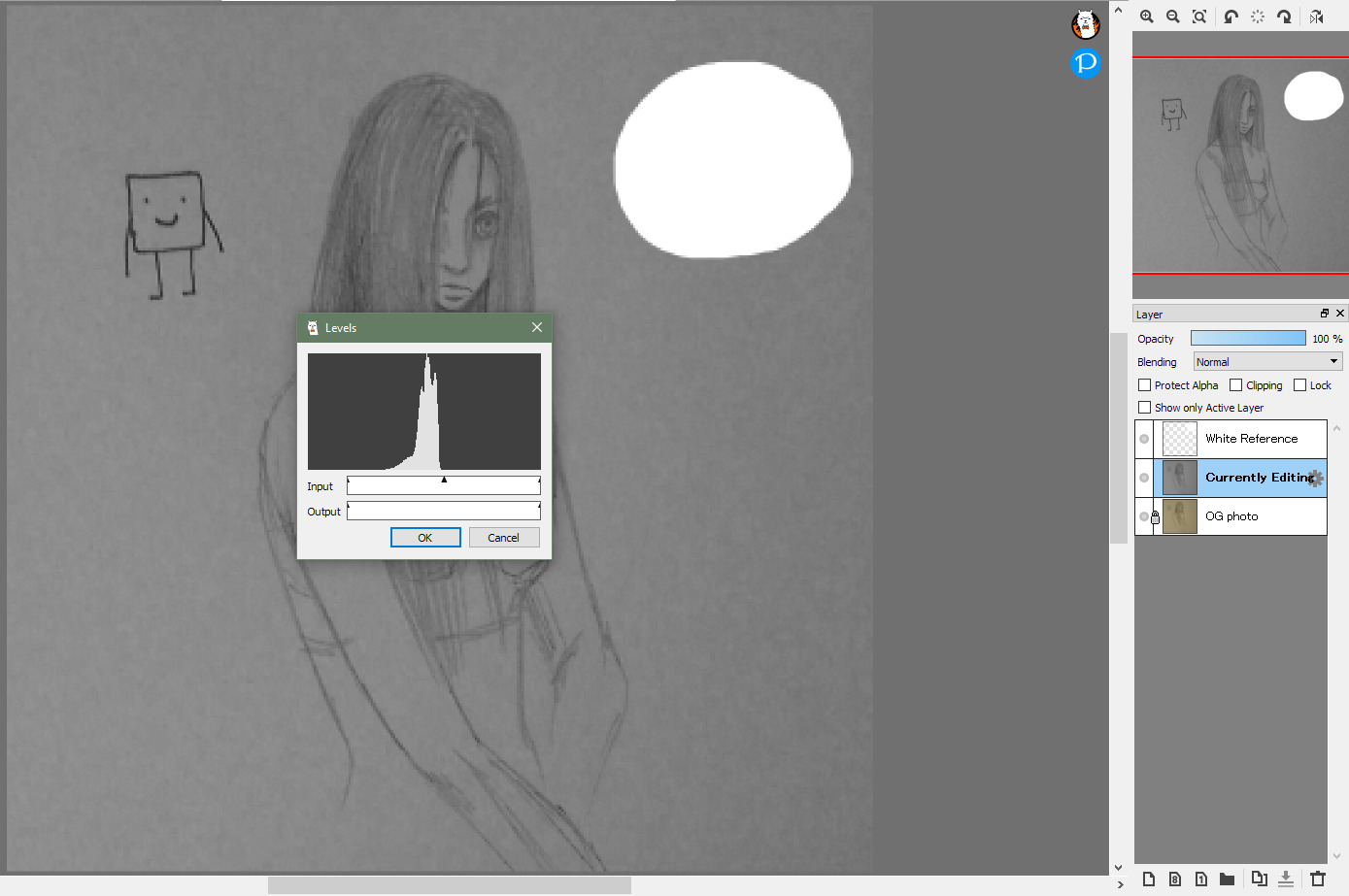
Press CTRL + L to edit the levels. I know this is a feature in all Photoshops, I can't speak for any other image programs though. This is how we will tweak the contrast.
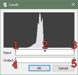
How the Levels box works:
- Move this arrow to the right to make darks darker.
- Move this arrow arround to change the value "midpoint." To the left will keep your image on the darker side, to the right on the lighter side. I reccomend leaving this alone, it stays centered automatically as you move the other arrows.
- Move this arrow to the left to make lights lighter.
- Move this arrow to lower the contrast by going towards pure white.
- Move this arrow to lower the contrast by going towards pure black.
- Simply put, the graph at the top is how much of what value ("darkness") your image has. Left is black, right is white. As you can see, my image is rather low-contrast and rather dark (most of it below the 50% mark,) though I do not actually get close to pure black.

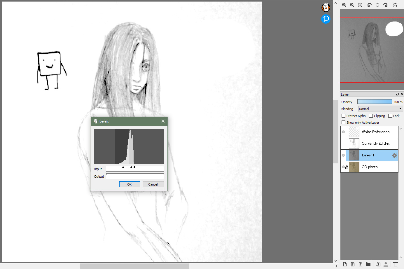
Here is my sketch after some tweaking. I didn't move the middle arrow. The darkest darks (square guy) are black and the lightest lights (most of the paper) are white, notably hiding most of the white reference blob. The image has become rather grainy due to the low quality of the original photo + how much I had to tweak it. Also, the paper is not pure white on the righthand side, as that's where the darkest of the shadows were.
Here's an example of what shifting the middle arrow would do.
Here's my final go after a little more editing. I did a second pass at adjusting the dark levels, and I used a white airbrush to cover the visible paper grain on the righthand side. Something I have done in the past for particularly bad shadows, is to make a new layer with a white-transparent gradient lined up with the shadow to cover it. Pick your poison though, as this will definitely wash out the lines of your image.
How much does your starting photo matter?
Left column: What I considered the better photo. Right column: The photo used for this tutorial.
The image on the left ended up having a much more apparent shadow than I realized, so I couldn't fully remove it without washing out the sketch. The image on the right became very crunchy through all the editing it had to go through, but it can pass as a scan. This is all very subjective. You have to consider what your end goal is. Do you just want a readable image to do do digital lines over? Do you want as good of a photo as possible to put a gradation map over, and upload that somewhere? Do you want an as-accurate-as-possible-to-reality photo to archive?
A slightly different approach, if you have Firealpaca
Here's my new starting image, I cropped it and made it grayscale already.
Optional: Make a new layer below your sketch that is just pure white. This will be the new background to your sketch (so you could make it any color you want, but white is a good way to help you keep an eye on values.)
Then; making sure the layer of your sketch is selected, go to "Filter" in the top bar, then click "Extracting Lines..."

This will bring up a window very similar to the Levels one. In this screenshot, I actually made half of the white background layer transparent to help see what's going on better. The Extracting Lines filter does exactly that, it turns the background of the sketch transparent and keeps the lines. You can use the three arrows and graph to edit the look of your lines however you please, with the same approach as with the Levels window.

This is a transparent PNG to show what the extracted lines look like (Try dragging it to this page's background) Extracting Lines is intended for, and thus invaluable if you want to color your sketch. Note that this is intended for finished line art though, so anything less than pure black will be at least slightly transparent. Basically, it's now a "black and transparent" image instead of "black and white."
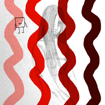

Examples of Extracted Lines V.S. A sketch with a white background, with its layer set to "multiply". The coloring process would be indentical, just the white will be preserved upon saving (as a png) for the latter. (Again, try dragging them to this pages background.)
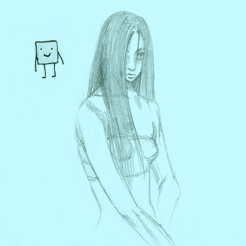
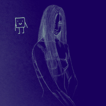
You may find the ability to isolate your lines helpful, though. In the first image I easily erased the visible paper grain, since there was no background (on that layer) to disturb. In both images I was able to make the lines and the background any color I wanted in seconds.